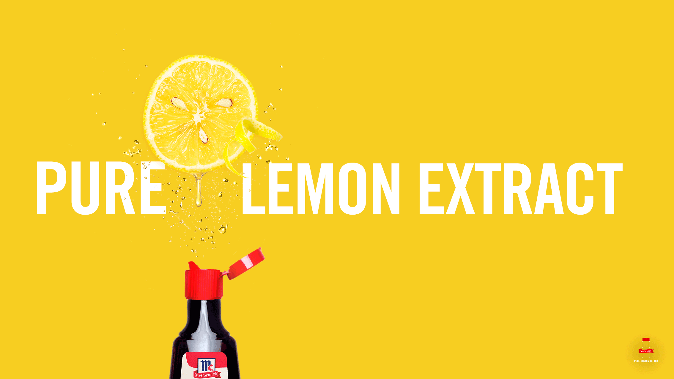
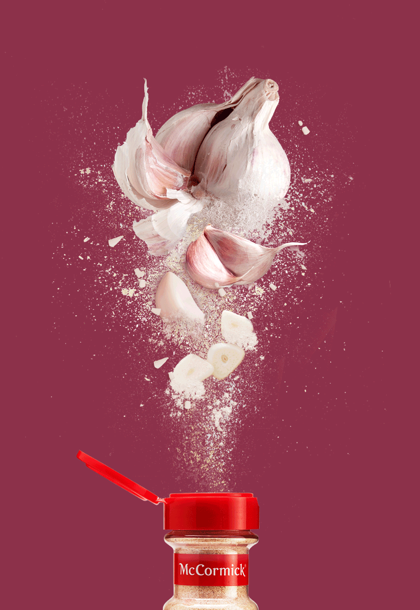
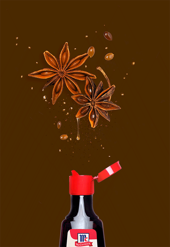
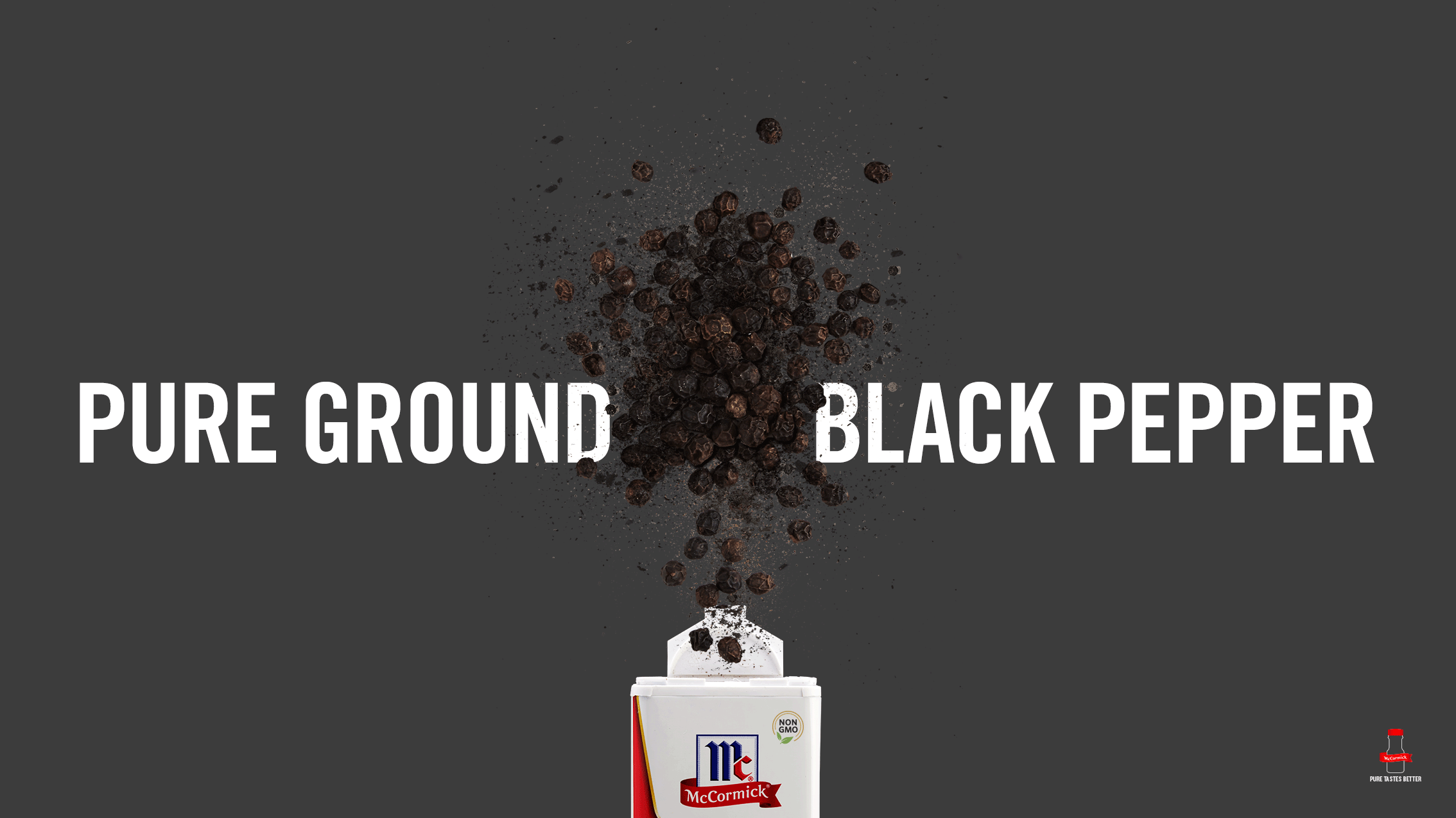
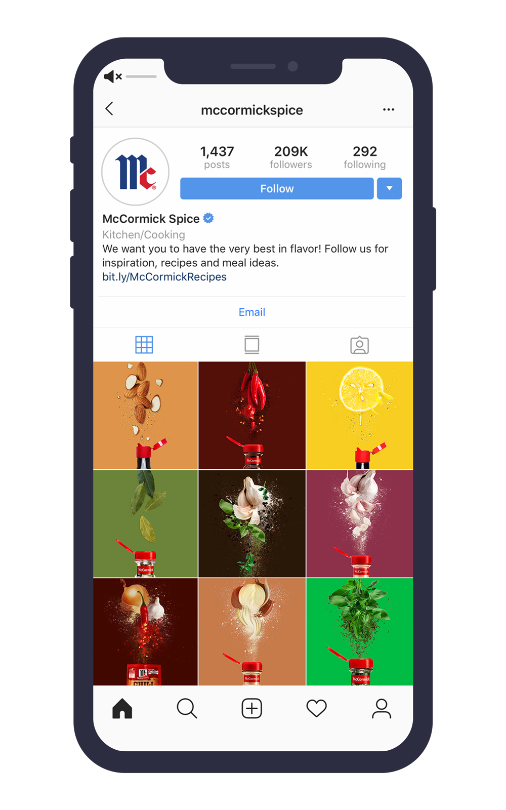
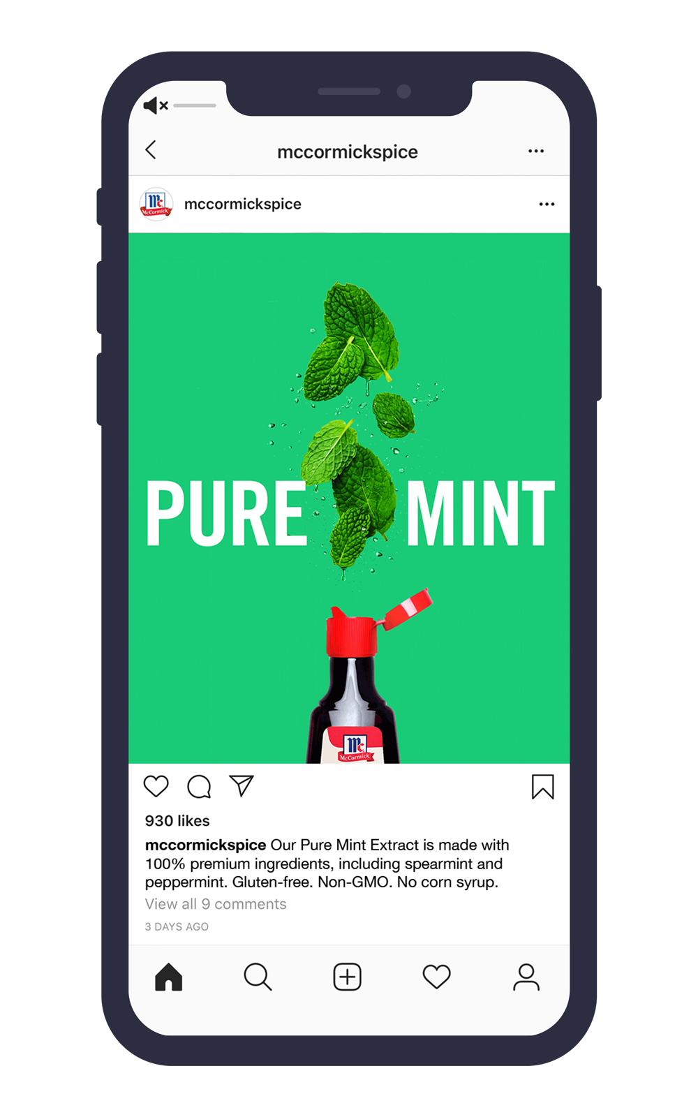
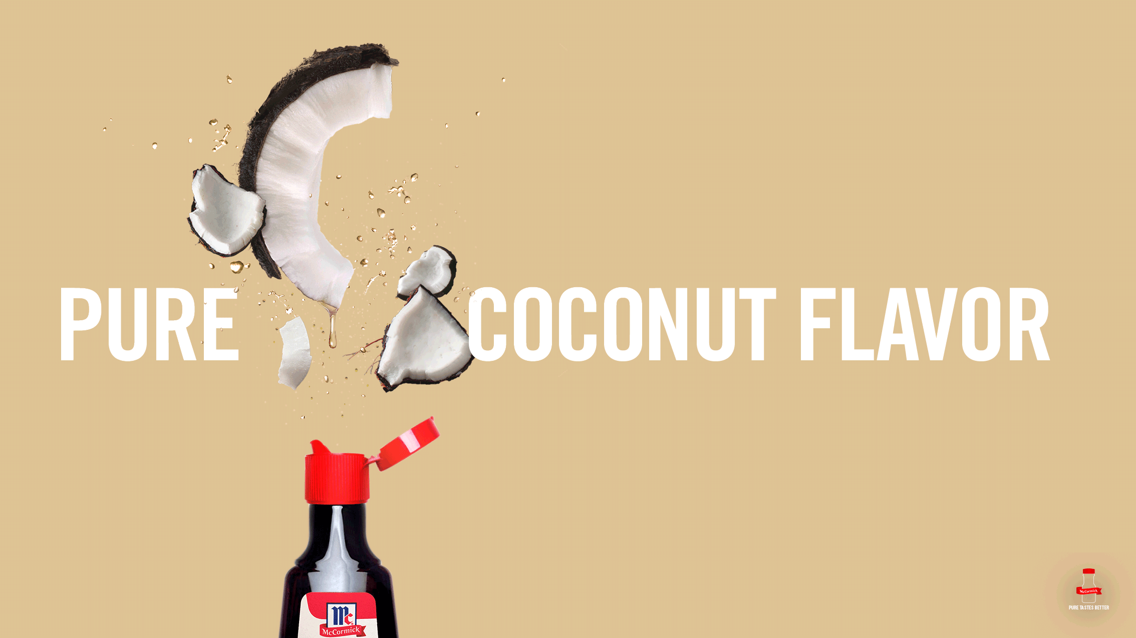
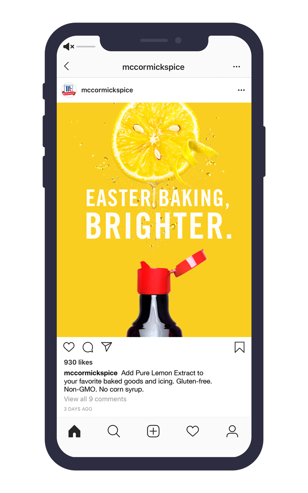
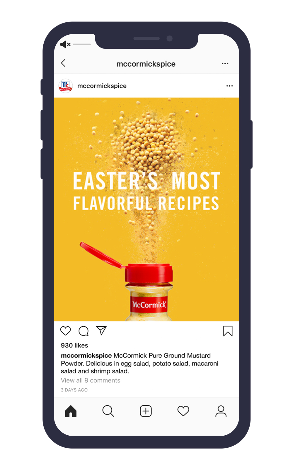
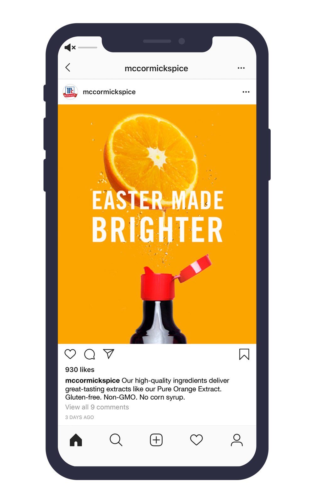
R/GA's Purity campaign for McCormick centered on a core truth:
PURE TASTES BETTER.
The ads focus on the simple beauty of the ingredients, with vibrant colors complimenting the products and creating visual flavor cues. Branding is kept to a minimum, just a peak of the iconic red McCormick packaging.
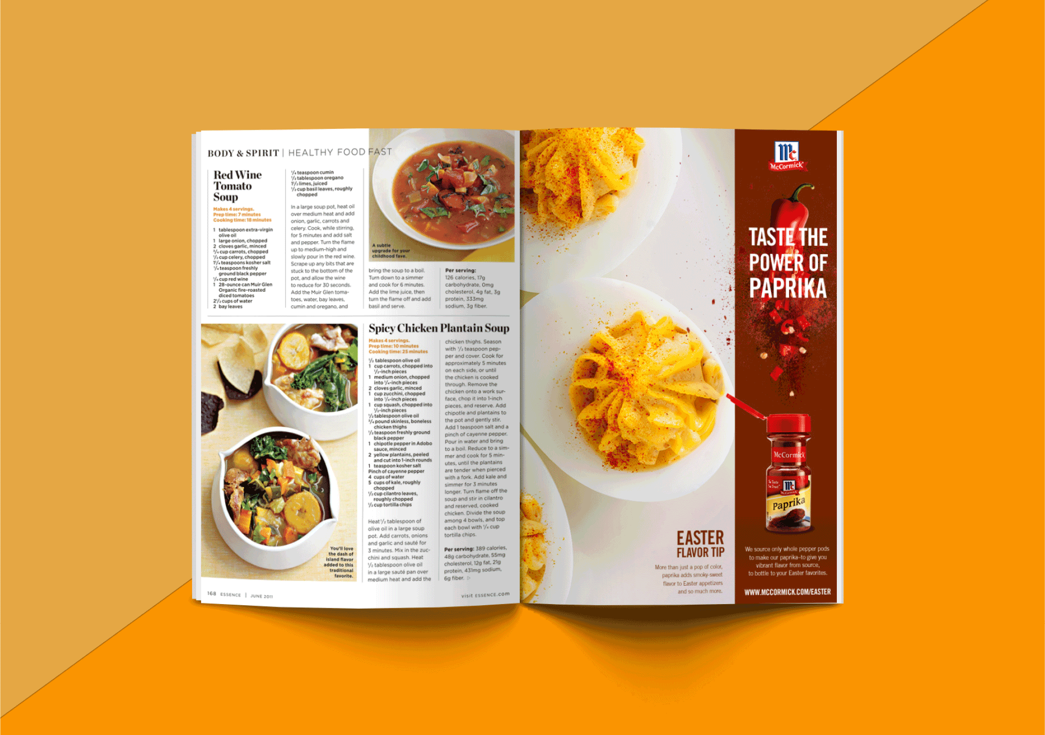
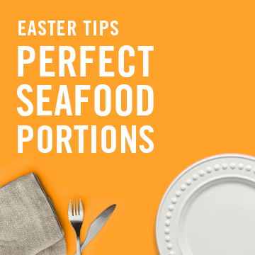
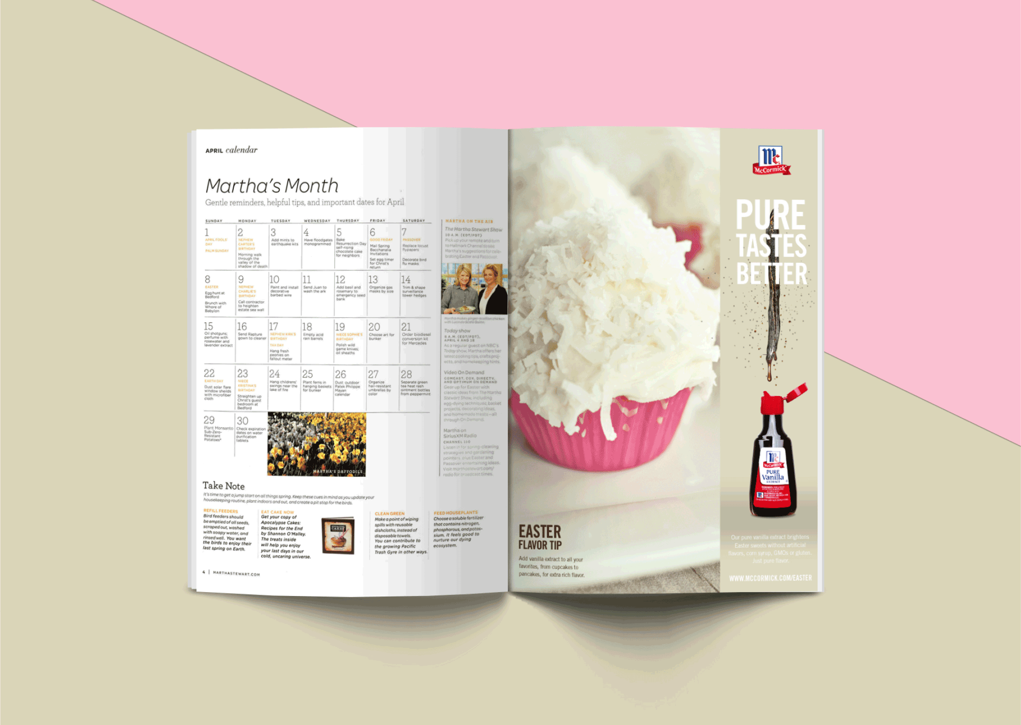
Excited about the new direction, the clients asked us to expanded the Purity look and feel beyond the core product line and into seasonal campaign work. For Easter 2016 this included R/GA's first ever print work for the brand, running in major publications including Martha Stewart Living, Southern Living, and People Food.
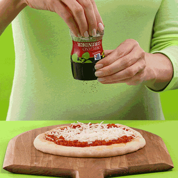
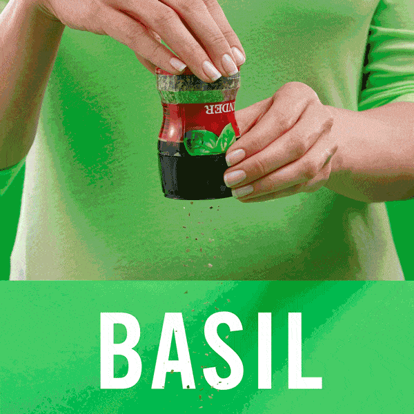
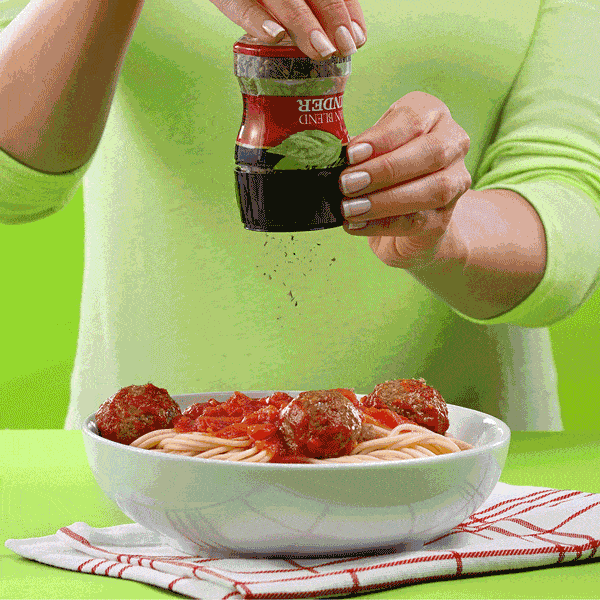
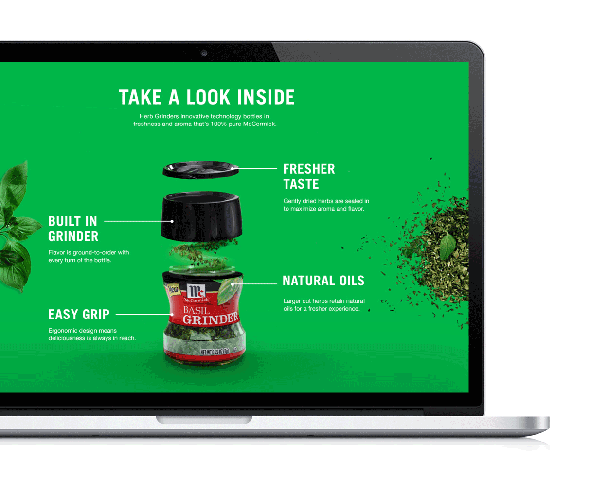
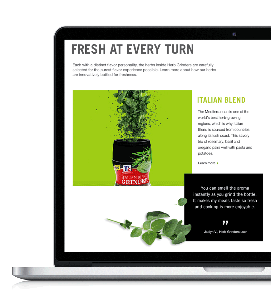
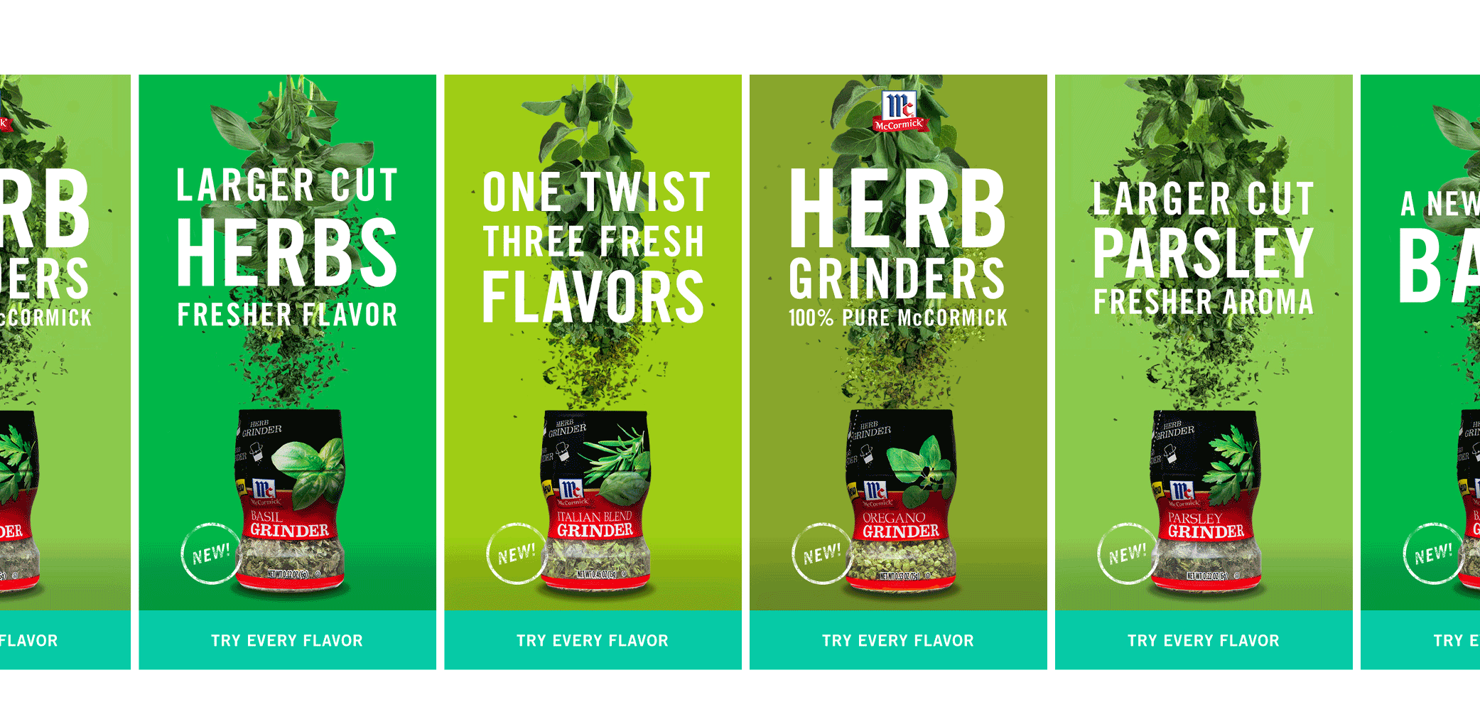
Expanding the project even further, we then added in the launch of a new product collection - McCormick Herb Grinders. This included everything needed for the launch - social announcement assets, landing page, and OLAs.